September 23, 2019No Comments

Your first 3D design tutorial with Adobe Dimension

For many creative folks, 3D design is still considered a final frontier. In our minds, it's a landscape marked with steep learning curves, expensive software and overwhelming interfaces. Little known to most of us, Adobe has been quietly changing that story.

In recent years, more designers are seeking to break into 3D design and more clients are asking for it. Yet for many of us, it still seems daunting and inaccessible. Only designers who have dedicated years of their life to the trade can master the complex tools and techniques required for it, or so we tell ourselves. Until a couple months ago, I'd see an artistic or hyperrealistic 3D image in someone's portfolio and couldn't fathom how they even began to create something like it.

With Adobe Dimension, Adobe has removed the barriers (real or imagined) between designers and 3D design. Originally created for 3D mockups and brand visualizations, Dimension has evolved into a powerful 3D rendering tool that allows you to create rich 3D visuals. What's more, it's easy.

Our team at Semplice.com recently released Warped Universe, a collection of abstract illustrations creatives to for their work. This was our first deep dive into Dimension. We began experimenting with Dimension's rendering tools and Photoshop's built-in 3D features to see how we could take these illustrations out of the two-dimensional world and into the dimensional space. We were both impressed and excited with the results, and so was our audience. Designers wrote us asking how we turned the flat illustrations into 3D, and we were thrilled to realize we could easily teach them.

In this tutorial, we will show step-by-step how to take your own designs and finally break into the wonderful world of 3D design.
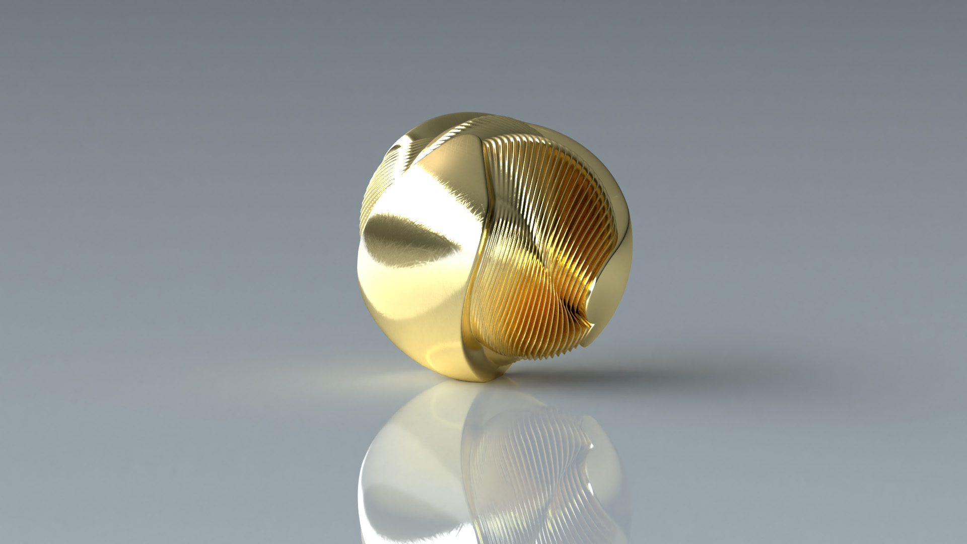
What we're making

With this easy 3D design tutorial (including a video option, if you prefer it) we will create an abstract 3D illustration using Adobe Photoshop and Dimension. We'll use Photoshop to create our basic 3D shapes, then switch over to Dimension to setup our 3D scene, create beautiful, realistic lighting, apply real-world materials and finally render out our 3D visuals.

While this tutorial walks you through creating a specific visual, the technique and steps can be applied to any design. Once you get a feel for Dimension by following these steps, I encourage you to experiment on your own and see what else you can create.

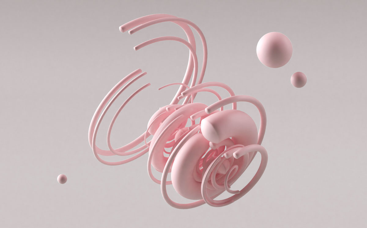
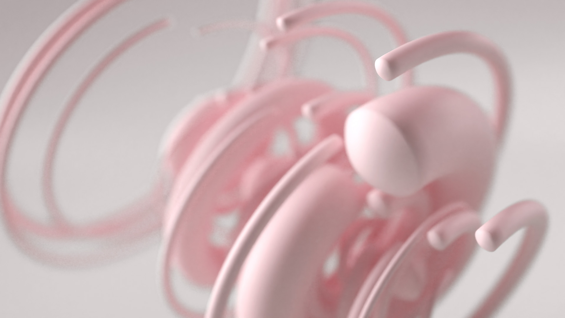
Here's the image we'll be making today, rendered out to show different angles and perspectives.

3D abstract tutorial illustration created with Adobe Dimension and Photoshop


What you will need

Optional video tutorial

If you prefer following along visually rather than following the steps below, watch this video tutorial. It goes through the exact same steps with the same result.

Step 1: Creating our shapes in Photoshop

We'll start by taking flat artwork and converting it into 3D objects. We will then bring these 3D objects into Dimension (in the future, you can expect Adobe to bring some of the native 3D creation functionality into Dimension itself). For simplicity's sake, we will convert flat circular shapes into 3D objects, but you are free to introduce more complex designs.

OK, let's do it already.

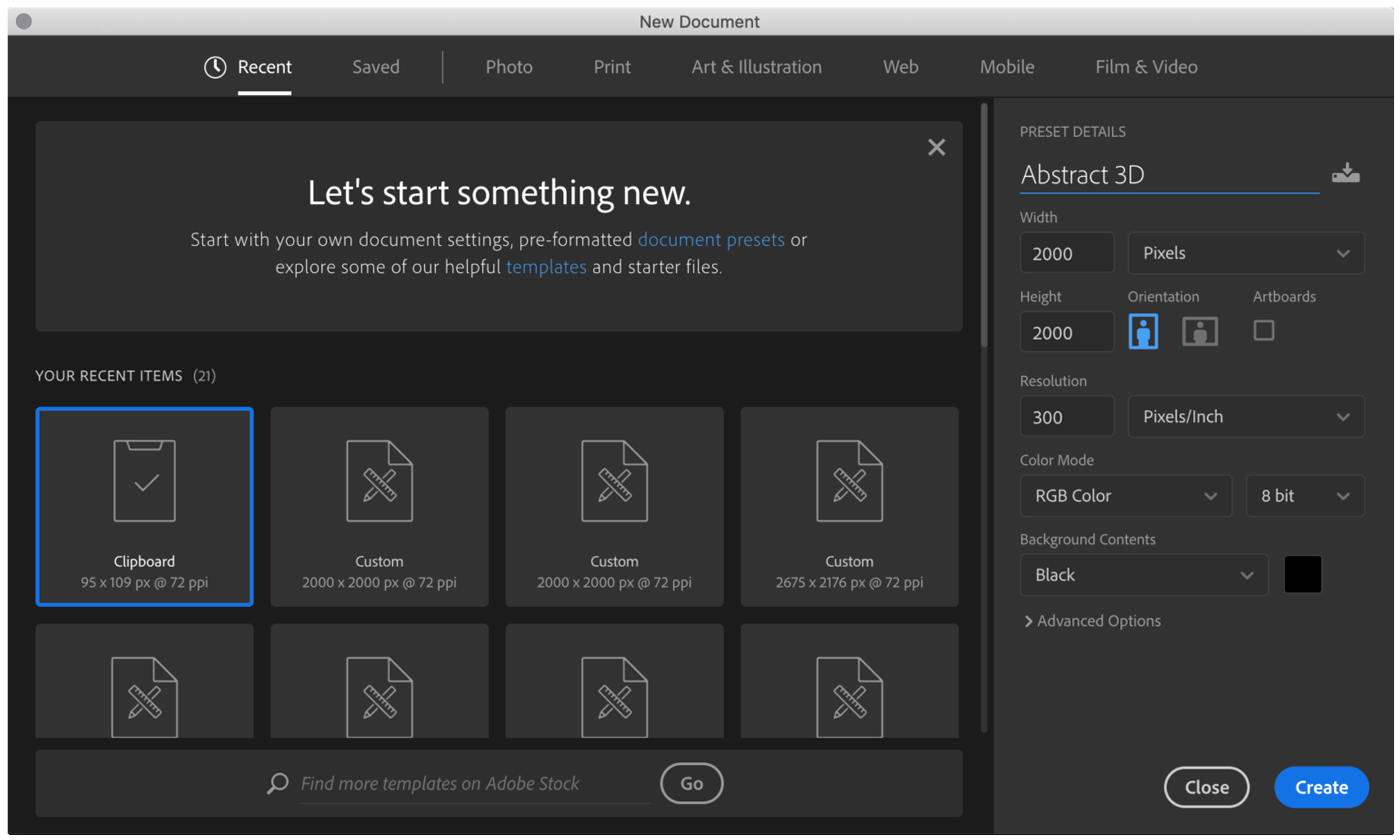
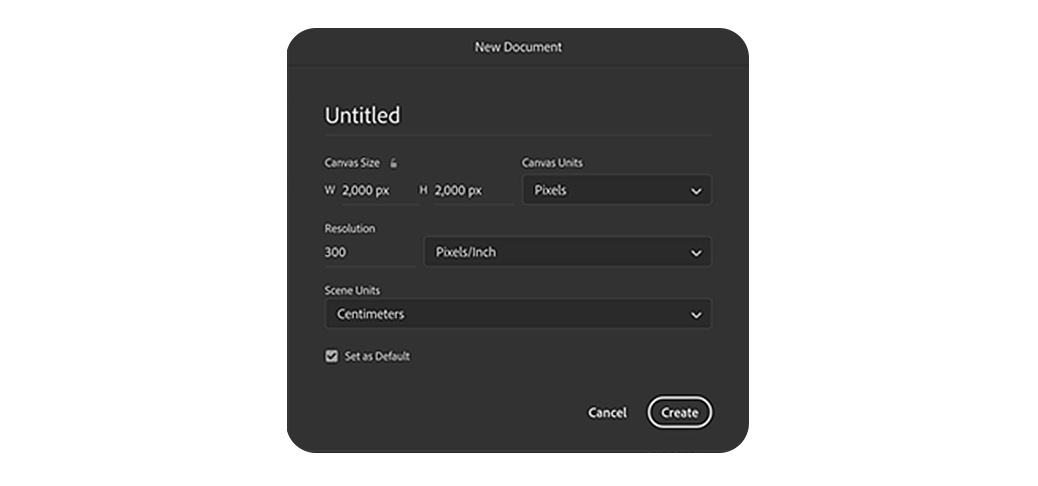
First, create a new document in Photoshop. Set it to 2000 x 2000 pixels with the background set to black.

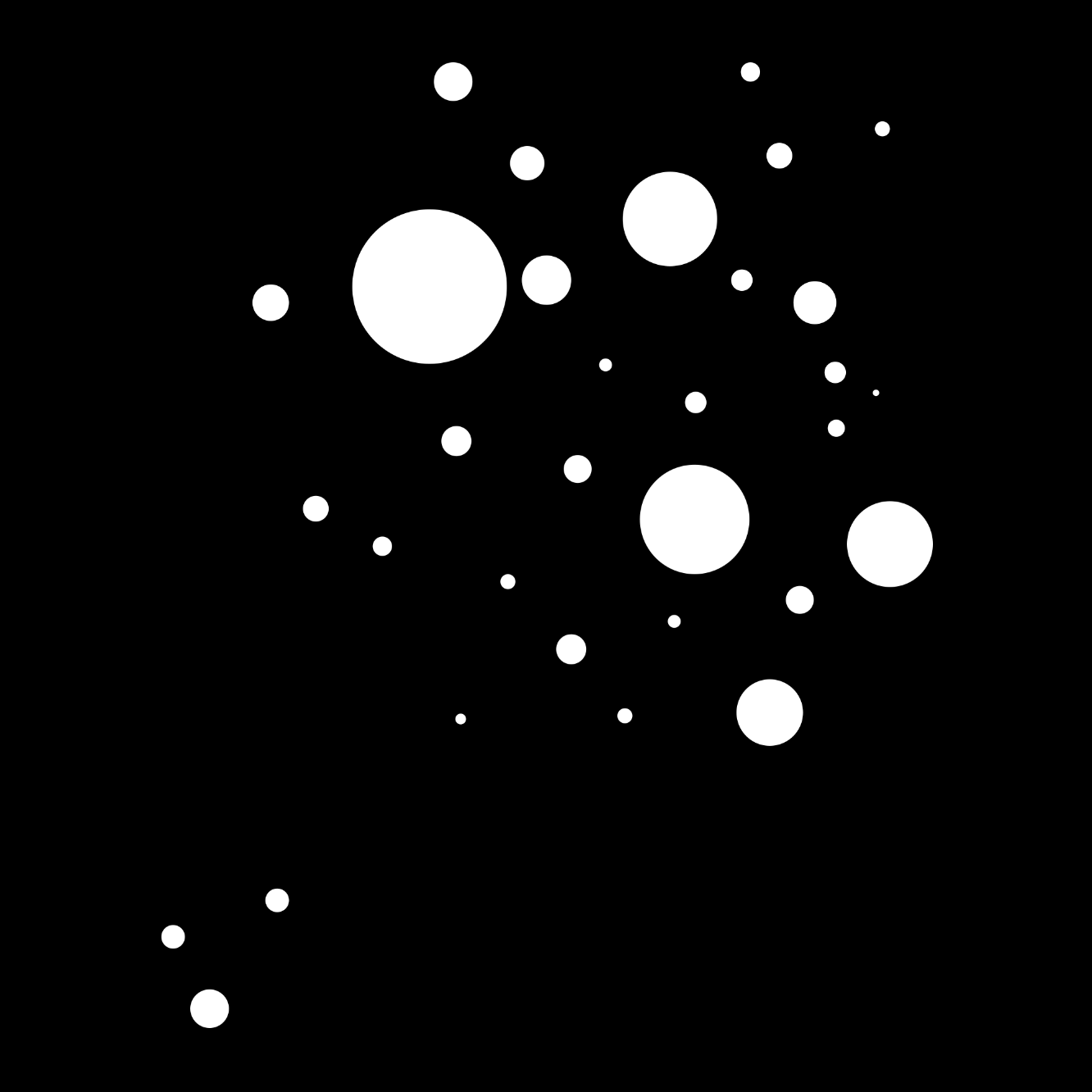
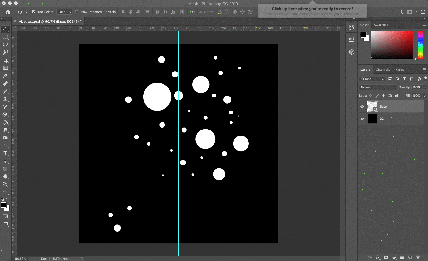
Now let's create our circular shapes. With the Ellipse tool in Shape mode, start laying out some circles on your canvas. Be sure your Shape options are set to 'Combine Shapes', so all your shapes are created in one layer.

When laying out your circles, add both large and small circles. This will create a nice variation in your shape later.

Pro tip: It also helps to have your shape set to 'Circle' instead of 'Unconstrained' in the Path Options.

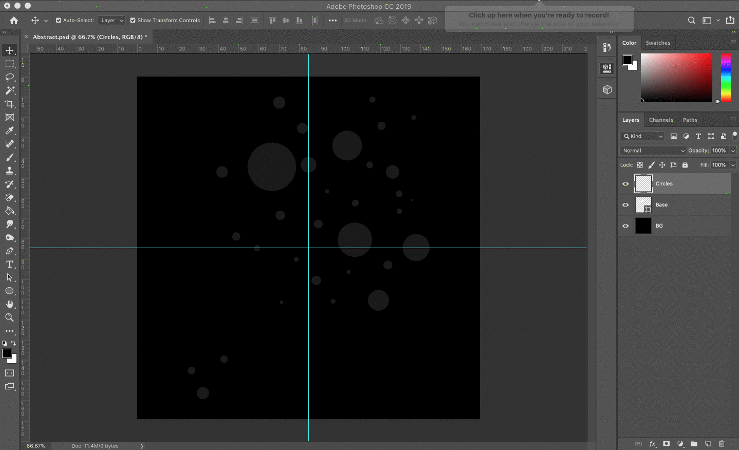
Your circles should look something similar to this:

Step 2: Extruding the Shapes

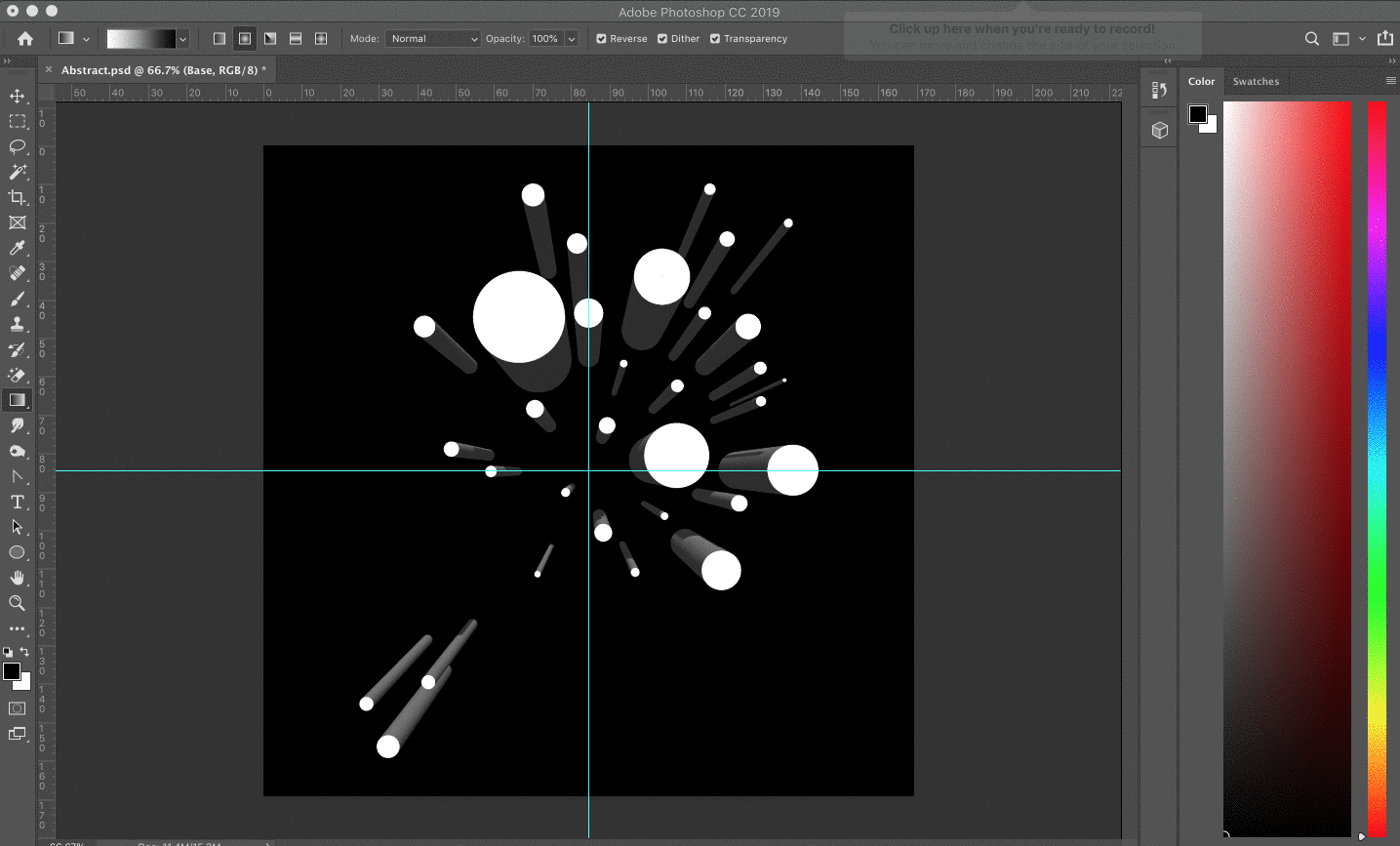
Now we will take our two-dimensional shapes and magically transform them into 3D. From the 3D menu up top in Photoshop, choose the 'New 3D Extrusion from Selected Layer' option. You should now see all your circles change into cylinder shapes.

Caution: avoid circles that are too small, or too closely spaced together. If your shapes are too complex, you will get an error message during the extrusion process.

Pro tip: You can use the camera tools in the lower-left corner of your screen to orbit the 3D canvas and get a better view of your object.

Next, with your scene selected, look for the Deform options under the 3D Properties window. (If you don't see this option, you probably selected the 3D mesh layer is selected and not your scene.) We will use these options to create, bend and twist our cylinders into abstract objects.

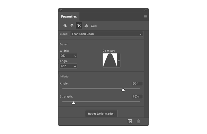
These are the options I've set below to create our abstract shape, but feel free to play around with these settings to create your own unique shapes and effects.

Here is the result these exact settings will give you:

Don't fret if yours doesn't look exactly like mine. If you used different extrusion depths, twists or tapers in the previous step, you will see your own unique shape.

Now, let's give our tube shapes a nice rounded cap. Still under Properties, simply go to the cap options and set a cap. Here is what I've used to create a nice beveled edge.

And here is the latest result with our new cap settings:

Optional: Optimizing our 3D object

As an optional step, you can use a free tool called MeshLab to improve the geometry and clean up any jagged edges in your 3D mesh. Use the subdivision tools to add additional geometry, smooth out your edges and do some general cleanup. You can view their documentation for more information on how to use the tool.

Step 3: Exporting our 3D shape

Hurray! We've got an awesome looking 3D shape already. But we're not done yet. Now we need to export our 3D object so we can bring it to life in Adobe Dimension.

To export your object from Photoshop, go 3D > Export 3D Layer and choose 'Wavefront OBJ' from the 3D File Format option. You can leave all the options set to the default.


Step 4: Setting up our scene in Dimension

Next, let's set up a nice little studio scene for our happy little objects to live in (thanks, Bob Ross!)

Open Dimension and go to File > New. Set your document to 1,920 x 1080 pixels with 300 DPI.

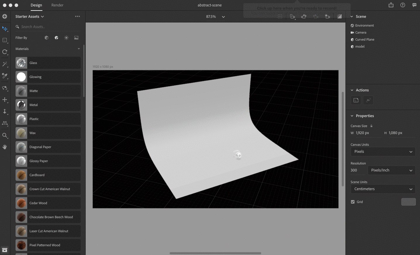
First, we'll add a nice curved plane. You can download one for free here. Once you've downloaded the file, go to File > Import > 3D Model in Dimension (or use the plus sign in the left-hand menu) and import your 3D plane.

With the curved plane selected, set the position X, Y and Z values to 0 if it isn't already.

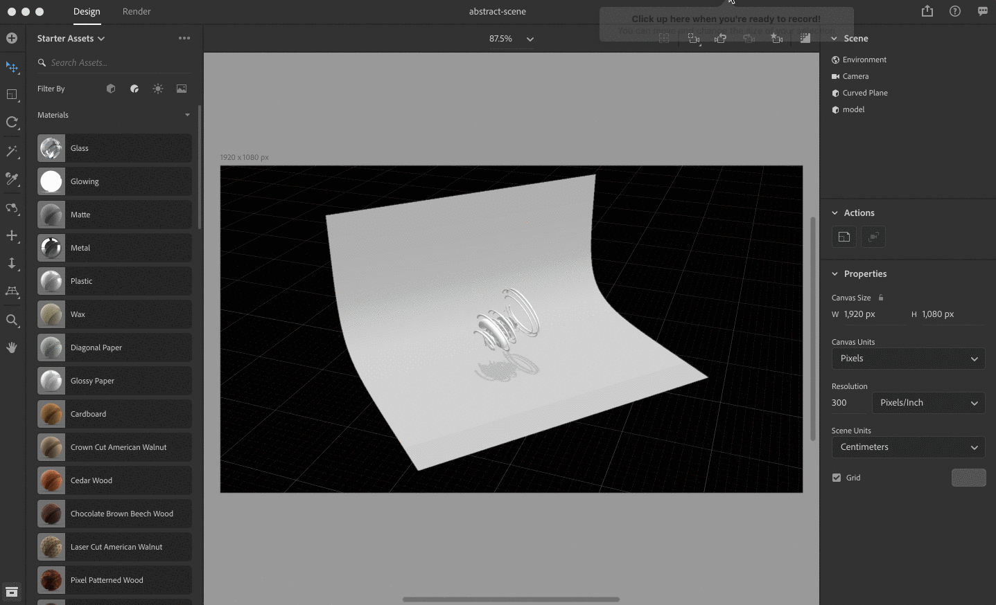
Step 5: Importing our 3D abstract artwork

Next, import your 3D object by following the same steps as above.

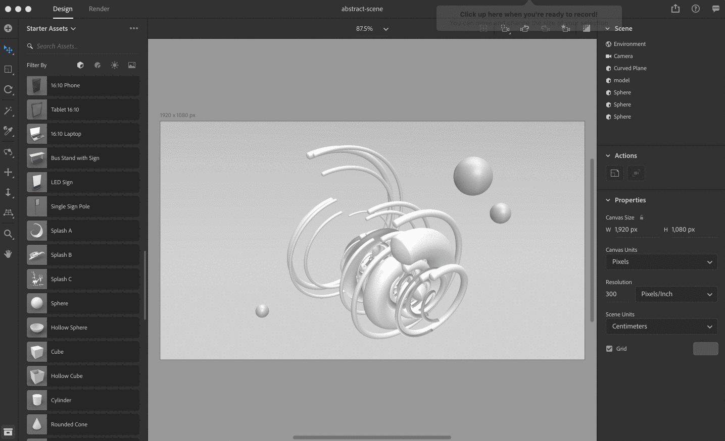
With the 3D model selected, use the Move, Rotate and Scale tools to put the object in the middle of your curved plane and move it into position.

Use the rotate (1), pan (2) or zoom (3) tools to position your camera within the scene and put your object in frame.

Pro tip: For an even faster method, hit the (F) key to zoom the camera to your object's current position.

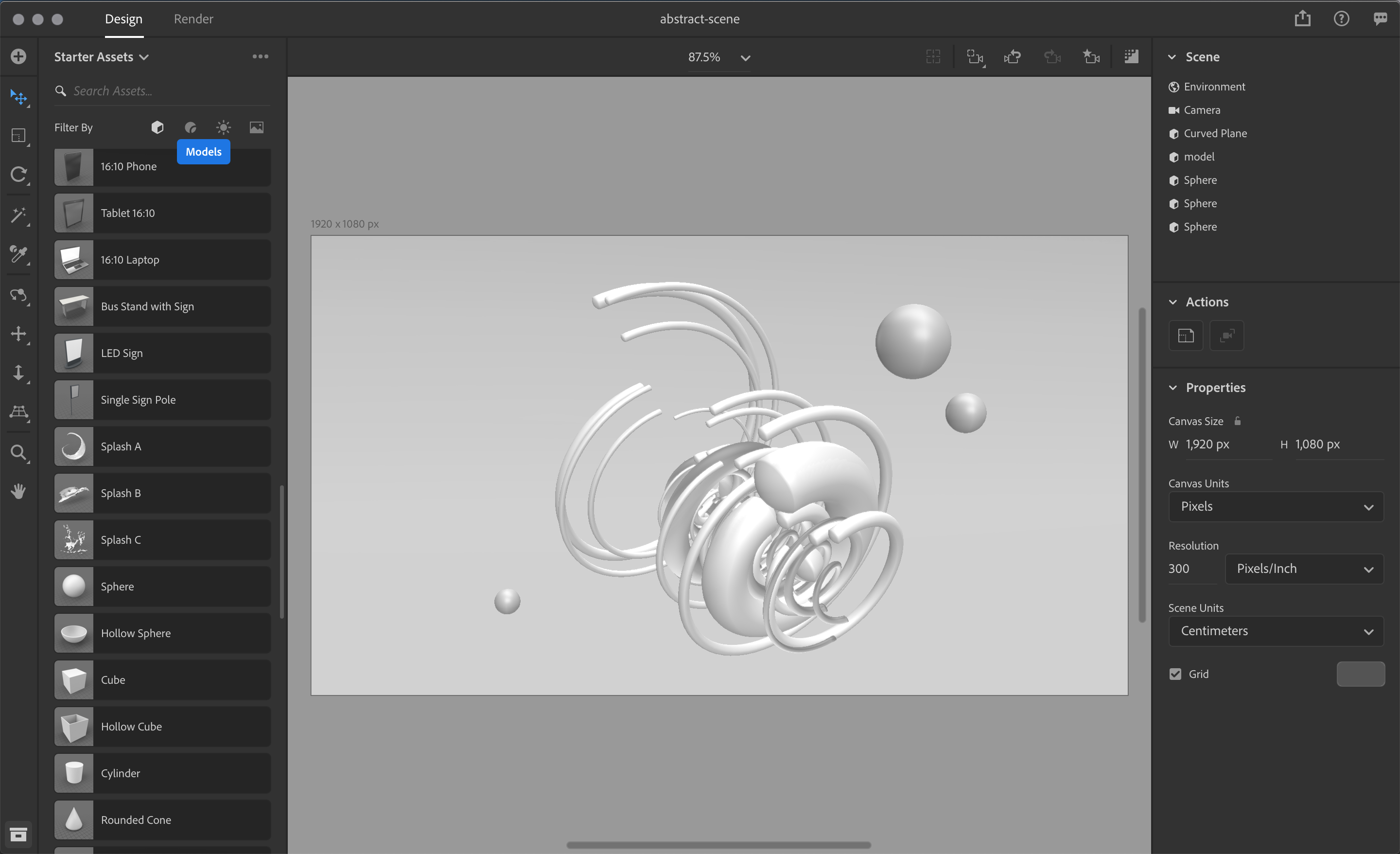
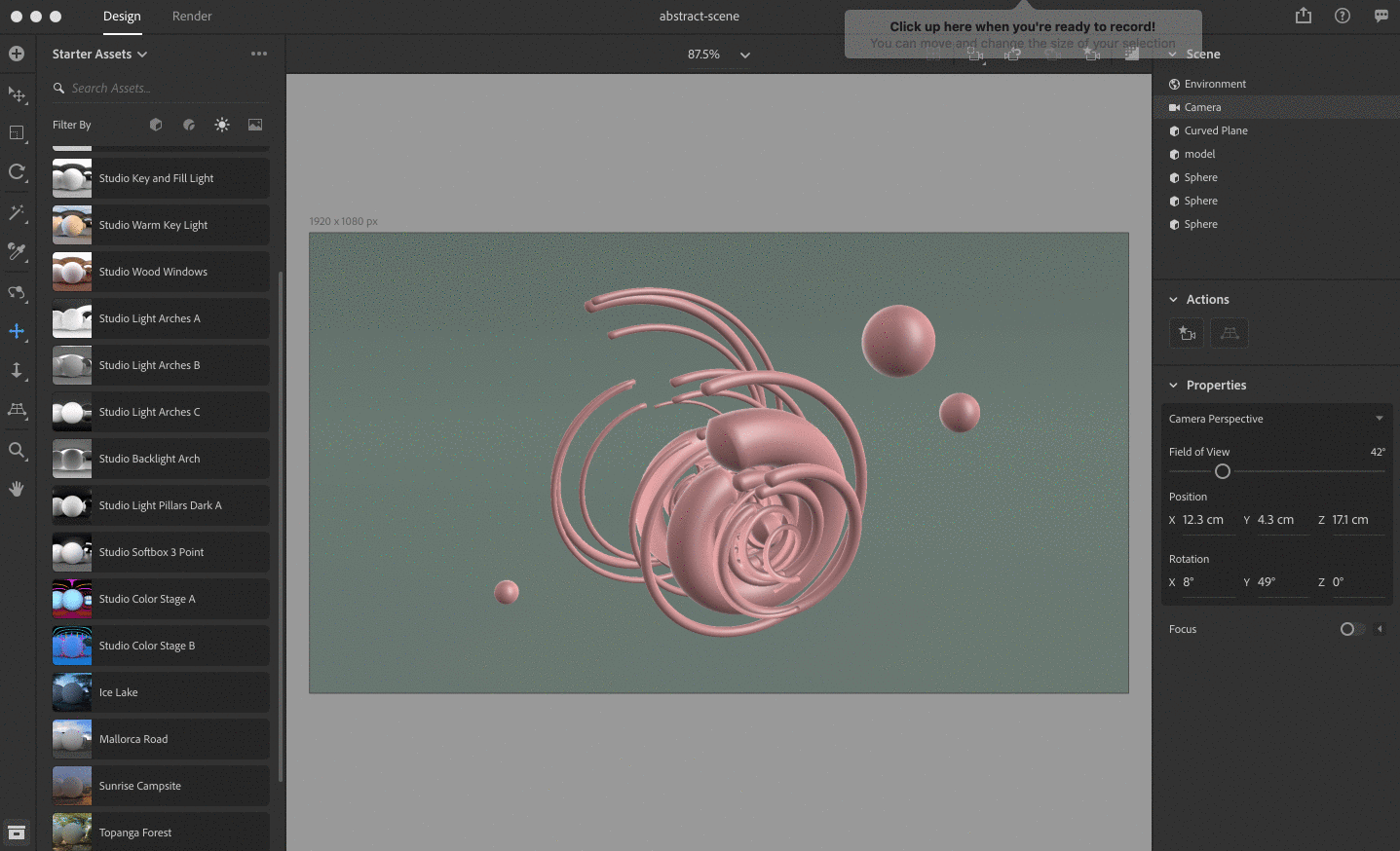
Now let's add a few more elements for fun. If you are looking for 3D assets to use in your scene, Dimension provides an array of options in the Starter Assets Panel on the left. You can also find additional assets, both free and paid, created to work perfectly in Dimension on the Adobe Stock 3D website.

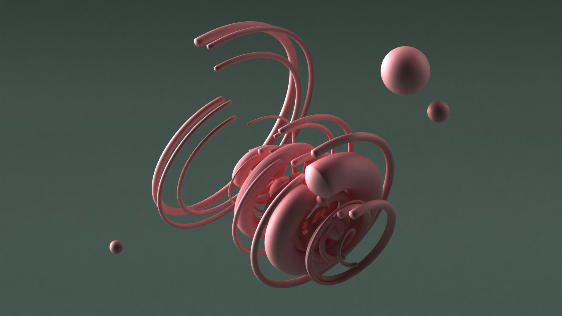
From the Models panel, let's add some spheres surrounding our abstract tubes. Looking pretty cool, right?

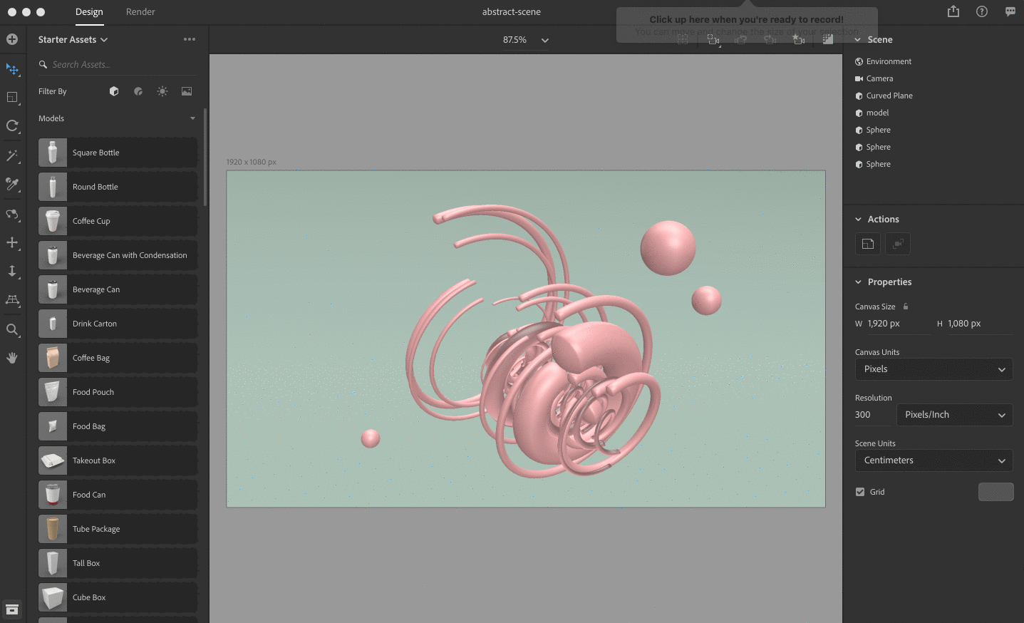
Step 6: Setting our materials

Now we can start having fun with our object materials. This is where our 3D design starts coming alive.

From the materials panel, select the Plastic material. Now set a color of your choosing with the roughness set to 50%. Setting the roughness to 50% will give our object a nice sheen without too many reflections.

Now go ahead and apply materials to the rest of your scene. You can also find more high-quality materials to use on Adobe Stock.

Pro tip: You can apply the same material to several objects by selecting all of your objects and applying a material.

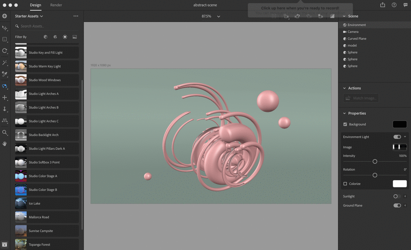
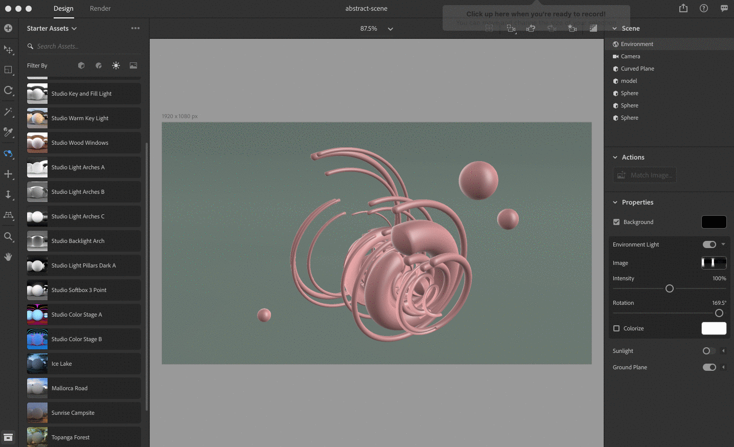
Step 7: Creating our lighting

The difference between an obvious graphic and a photorealistic 3D image comes down to lighting. Adobe Dimension's lighting presets makes it simple to create lighting that reflects off your object in a realistic way.

Dimension uses image-based lighting, so you can either upload your own image or use one of their own lighting presets. For our purposes, let's choose 'Studio Light Pillars Dark A.'

Next, you can play with the rotation values to get a lighting effect that looks best to you for your scene. Lighting is key to great 3D imagery, and finding nice contrast with your shapes may take some tweaking.

Pro Tip #1: It helps to use the render preview to see how your scene is looking in real-time.

Pro Tip #2: More lighting options can be found on Adobe Stock 3D.

Step 8: Setting our camera

Now we can use the camera tools to get some interesting angles and depth with our illustration. This will also add some depth of field for a more dynamic image. Just play around with settings like Field of View, Focus and Rotation to see what you like.

PRO TIP: You can use the bookmark tool to save different camera views within your scene.

You can also use the focus option in the Camera settings to add some depth of field to your view.

Step 9: Rendering our scene

We're almost done! Now we just have to render our scene.  I recommend using the Low option in Dimension to get an idea for how your scene looks, and then using an option like Medium or High when you're happy with the results. I chose PSD as my output type.

Pro Tip: You can also export via a weblink to share 360-degree views with stakeholders or embed on your portfolio.

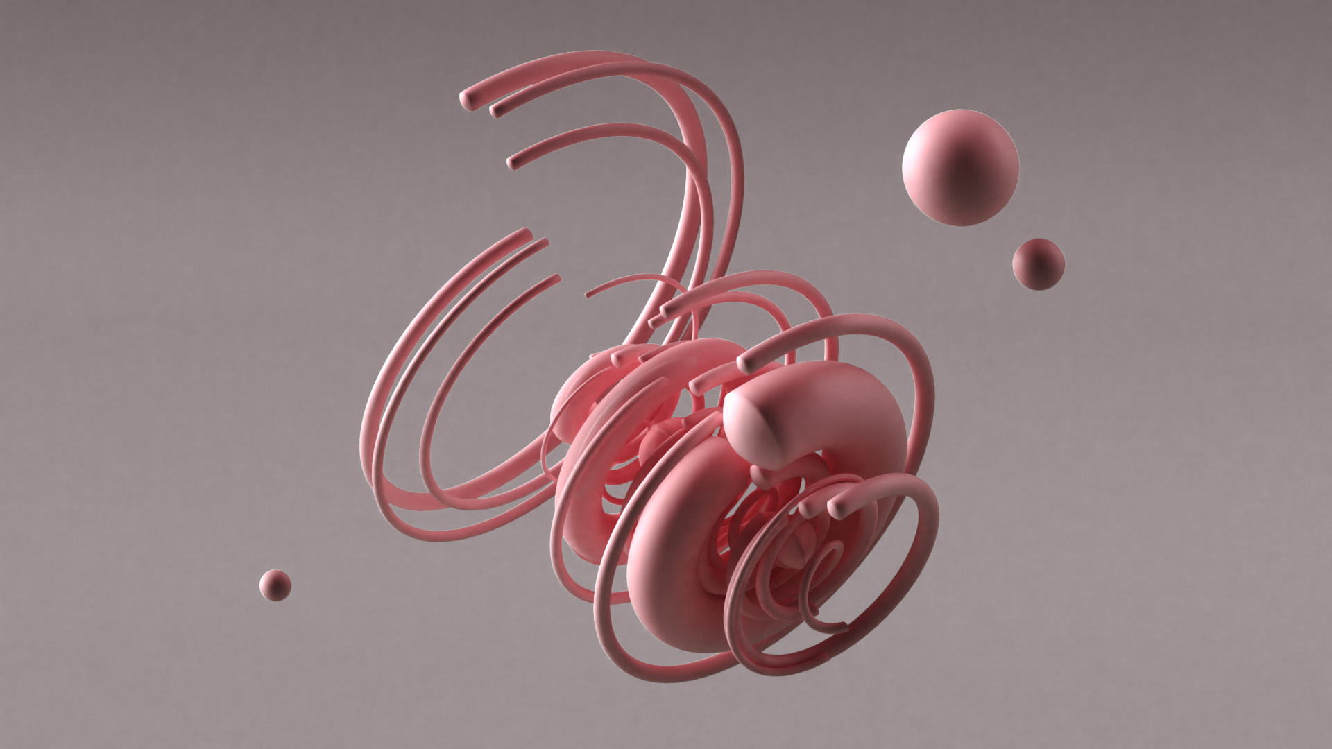
And here is the result of our render. Take a close look at those reflects, the shadows, the textures and shapes. You made that from mere circles just minutes ago!

And now, after some post-processing adjustments in Photoshop (because what designer ever knows when to stop):

Adobe Dimension tutorial abstract 3D visuals

Experiment even further

Now that you've learned the basic principles for creating 3D objects in Photoshop and rendering your objects in Dimension, you can use these same principles to experiment further with more complex designs.

As I mentioned at the beginning of our tutorial, we've been doing this with our Warped Universe illustration pack. For example, here's a 2D image from Warped Universe:


Here's a 3D topographic shape I made with that illustration using Photoshop and Dimension:

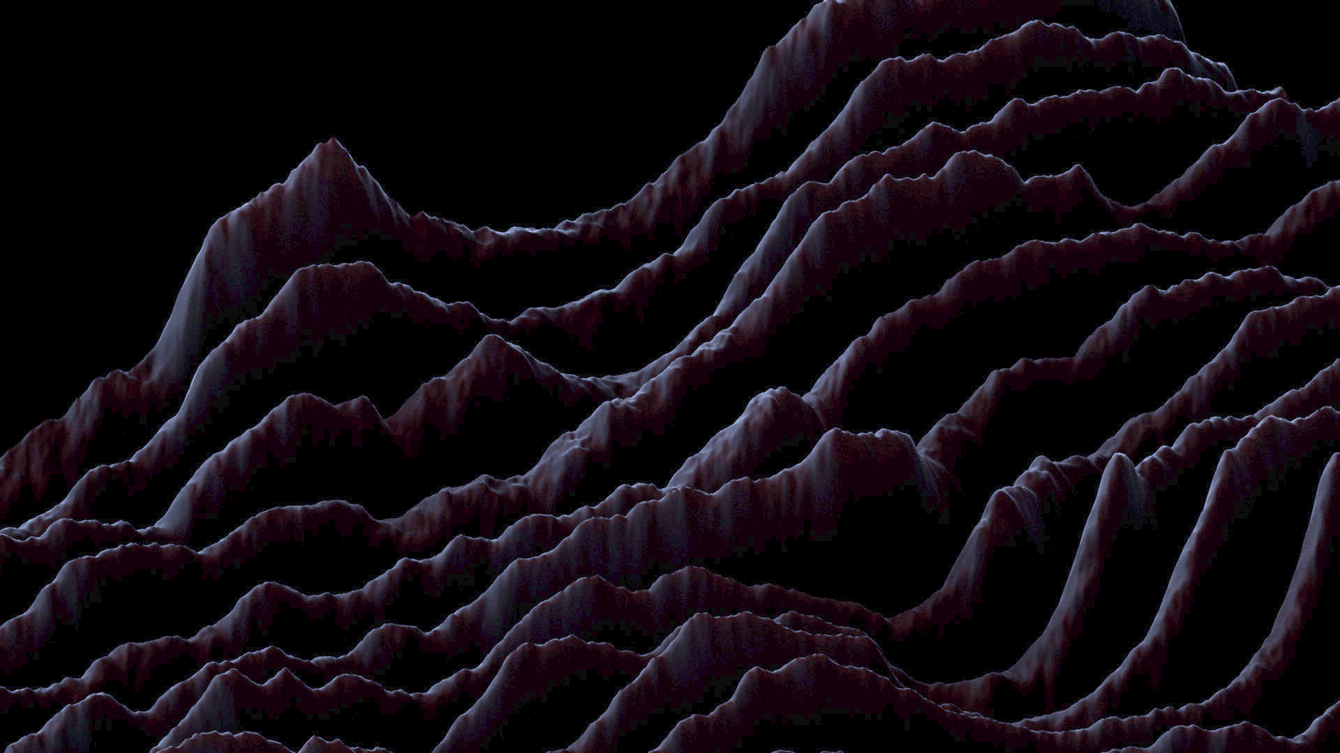
For this one, I used the "3D extrusion from depth map" option in Photoshop. Depth maps create 3D geometric based on the light and dark values of an image. The lighter the area of the image, the higher or more intensified the 3D extrusion effect will be.

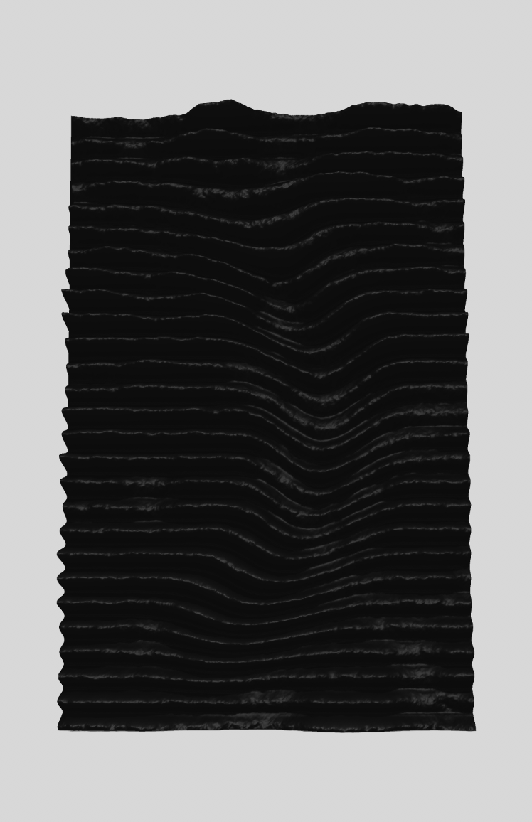
So I simply took that flat illustration above and generated some clouds on top. I then darkened and blurred the imagery.

Now here's the result in Photoshop after converting the flat image to a 3D extrusion depth map:

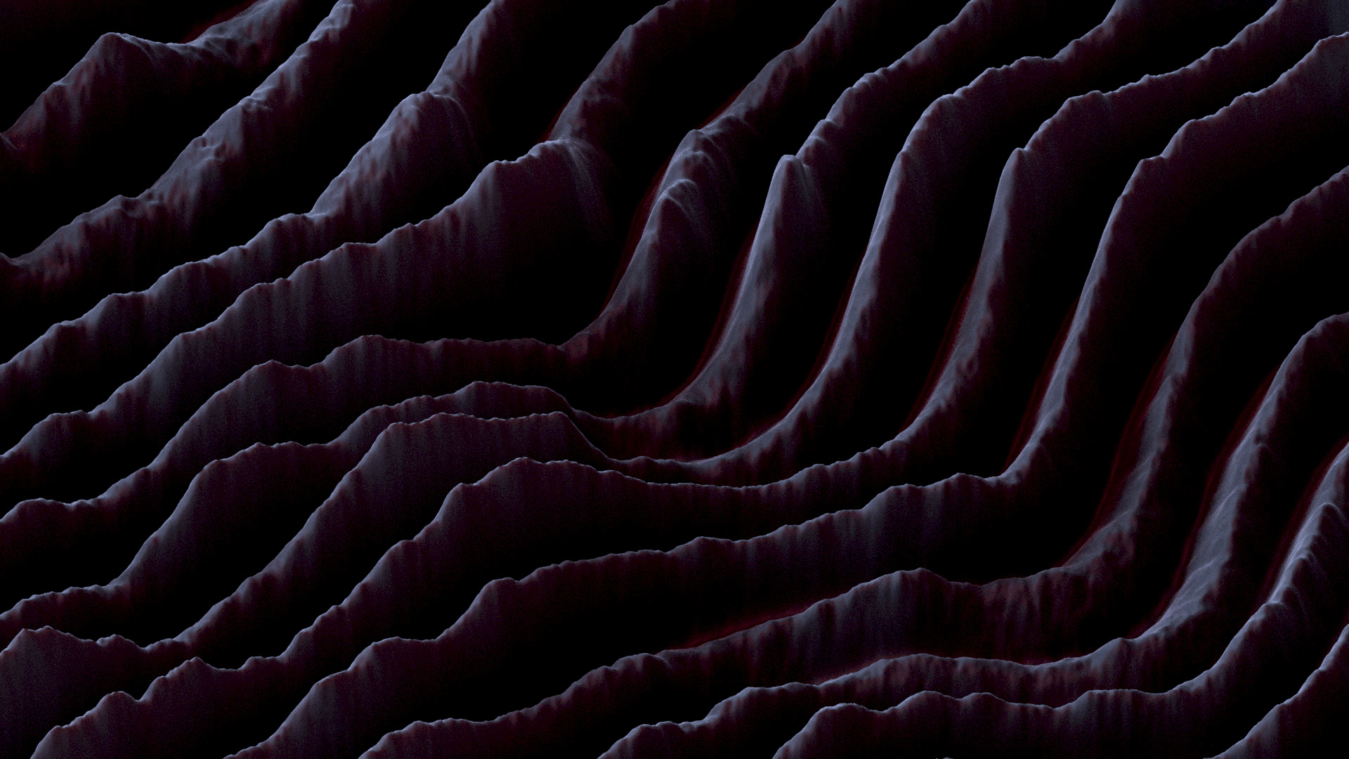
And here it is in Dimension:

You can also use the depth map option with the 'sphere' preset to render your flat images to spherical objects. Below is the result of a Warped Universe illustration I converted to an abstract spherical object:

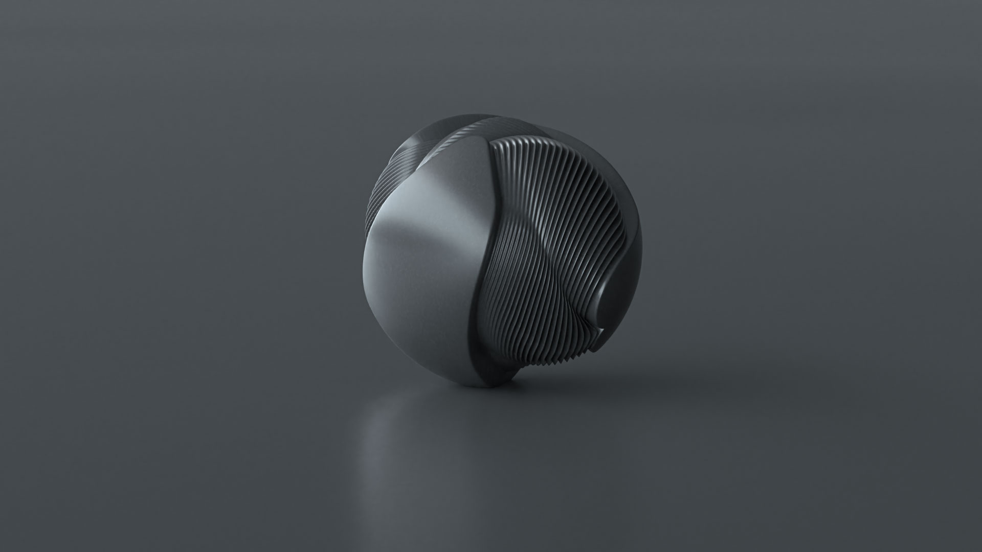
You can experiment with various light presets and materials to give it different textures and styles, basically turning it into a completely different image:

Adobe Dimension tutorial abstract 3D visual

Now that you know the basics, how you use and experiment with them is really up to you. Take one of your own flat illustrations or designs and walk it through the steps, see what it turns into. This opens up endless possibilities for your work and hopefully soon, your career.

As Bob Ross also said, "There's nothing wrong with having a tree as a friend." Oops, wrong quote. He said: "Talent is a pursued interest. Anything that you're willing to practice, you can do.” Thankfully, with Adobe Dimension, this interest is now easier to pursue.

If you do create something with Dimension, be sure to share your designs to Behance, selecting Adobe Dimension under “Tools Used” in the Basic Info tab. On Instagram, tag #AdobeDimension and #CreatewithDimension. This allows the Dimension team to find and promote your work!

For more 3D inspiration made with Dimension, visit the Dimension Behance gallery

__

Read our other 3D design tutorials with Dimension:

Creating packaging & prototypes with Adobe Dimension
A beginner's tutorial to creating 3D typography 
The unexpected addition to our creative workflow

February 19, 2019No Comments

Introducing: DESK Partnerships

If you've been reading here for a while, you know that DESK marked its two year anniversary just a couple months ago. What began as a weekly email newsletter eventually turned into a full-blown blog (the one you're reading right now) with a regular publishing schedule.

Our goal with DESK has been a simple one: write from and for creatives. When looking at the majority of design blogs these days, they're usually written by marketers who don't work in the design industry. After reading one more article about "The Top Design Trends for XXX" by someone who doesn't even practice design, we decided to write our own. By designers and for designers.

Over the past two years, we've been quietly trying to form our own voice and point of view. We've stayed away from guest posts and turned down sponsored articles. We wanted to make sure we knew who we were before we collaborated with other companies or writers. While this meant DESK would be completely self-funded without advertising (other than our own product ads), we felt it was essential for us to "find ourselves" before taking a step forward.

But today is the day. We're opening up DESK and introducing our new partnerships program.


Be the monthly sponsor of DESK

We're opening up a slot for monthly sponsors of DESK. If you look at the right top side of the blog homepage, you will now see a little banner. A banner that could be yours. If you would like to become a monthly sponsor and share your company, product or message with a creative audience, this is it. The only banner on the homepage, just you and us.


If you want more information about what else is included in this package, please reach out to business@vanschneider.com and we'll send you our sponsorship deck.


Sponsor a series

A little over a year ago we introduced SERIES to DESK. As you might guess, series are collections of articles following a theme we find compelling. Current series include "Design Around the World," the "Freelance Life" series, "How to Get a Job at X" as well as our "How to Move to New York." Each series now has a little logo at the top, which can be yours. If you decide to sponsor a series, you will be front and center as we share new series articles with the design community each month.

If you're curious about this option, please contact business@vanschneider.com and we'll send you our sponsorship deck.


Let us write about you or your product

In addition, we're opening up DESK to a select few who would like to work with us on articles in partnership. This could be one article or a series of articles. We can write them for you and about your product (or a related theme), or they can be written in partnership with you. Whatever it may be, we're open to it as long as we know our readers will find these articles useful.

For us, sponsored articles shouldn't feel like advertising. They should feel like genuinely useful and relevant articles that fit within the framework of DESK and meet the level of quality our readers expect. But to be fully transparent to our readers and give your brand the spotlight it deserves, each article will bear a badge at the top with your name and a link to your site. This will indicate whether an article is sponsored content, partnership content or a paid review. In any case, we will not publish press releases. Our DESK editors will work with you to create the perfect articles for our readers that promote your brand in a transparent way.


We're excited about this new step and curious where this will take DESK in the future. If you're interested in any of these sponsorship packages, please do reach out to business@vanschneider.com and we can develop a personalized plan for you. We hope this evolution will help us grow DESK and not only make it more sustainable, but also open it up to different voices and content we weren't able to share with you before.

And as always, thank you SO MUCH to everyone who's reading and supporting our independent writing. We'll continue to stay true to our original goal: writing useful articles by and for creatives.

Tobias &  your DESK team

September 15, 20181 Comment

We’ve done it again: Introducing the new iPhone

Welcome to the Steve Jobs Theater. We have something special to share with you today.

We’ve already given the world innovative technology like the Apple I and the Apple II and also the Apple III, the iPod, the iPod Touch, can’t forget the Nano, the iPhone X, the iPhone XR, the Triple X and well, now this.

*Clicks to next slide.*

2019 - Our biggest screen yet. Yes, bigger than the last one. The screen is so large, we’ve created pants with pockets especially for this iPhone. Introducing the iPants Max, available in sizes small, medium and max. Buy a different pair for each day of the week. Or just wear the same pair every day like our beloved Father Jobs.

2020 - You guys hated that notch so much, this year we went anti-notch. In fact, we’ve decided phones no longer need front-facing cameras at all because no one has ever benefited from them. Call it courageous.

2021 - The best smartphone camera in the world. The team tells me we have some kind of chip in this one made with breakthrough technology. Images are 10x more crisp, with more color and depth than ever before. It’s like real life on your phone. Your phone is life now. Please keep using your phone.

2022 - First you guys want bigger screens and now you’re telling me the phones are too big. You kids keep me young, ha ha. Well this iPhone is so small, it could fit on your wrist. It’s basically just the Apple Watch from two years ago because we had a lot of those left over. Yeah, so. It’s just the Apple Watch, really.

2023 - You will never believe what we made for you this year. This iPhone is so durable, so waterproof, you can actually swallow and ingest it. The new iPhone is inside me right now. Our most ingestible iPhone yet.

2024 - Bigger. Faster. Smarter. Precision-machined. Surgical-grade stainless steel. Precision. Faster. Did I say that already?

2025 -  An all-new generation of iPhone with facial recognition so advanced, it recognizes you even when your face is twisted in emotion. It’s now easier than ever to open your iPhone while crying about the emptiness and existential angst you feel inside. Adapters sold separately.

2026 - Our most unavoidable iPhone yet. You are now required by law to have one. Do not leave the building without your issued iPhone Overwatch.

December 19, 2017No Comments

My Jump from iPhone to Android: An Unsponsored Pixel2 Review

First of all, this article is NOT sponsored by Google. But if anyone from Google is reading this and wants to send me the Pixel XL, please do, because I’d love to test that phone as well.

A little over a month ago I switched to the Pixel. I’ve been on iOS and the iPhone pretty much since its inception or just shortly after. I think the iPhone 3G was my first iPhone. I never even thought about switching, not only because I was a little Apple fanboy, but also because there was just no reason. I liked the iPhone and I liked iOS. Whenever a new iPhone came out, there wasn't even a question about getting it or not getting it. Even if I couldn't afford it, I wanted it.

I briefly tried using an Android device a couple years ago but abandoned it after less than a week. Android always felt like a shitty operating system to me, not refined and just thrown together. But something is different this time.

I probably would have not switched if iOS hadn't let me down so much since the new iOS11. My iPhone was basically unusable for the last couple weeks; even after I got the iPhone8 I just wasn’t happy with it. My iPhone kept crashing, iOS kept freezing and apps behaved in a weird way. I knew these things would eventually get fixed, but it was reason enough to finally give Android a try again.

So I did, I switched to the Pixel2. The regular size, not the Pixel XL, because I like smaller phones. The iPhone5 is probably my favorite when it comes to the form factor and the Pixel2 is fairly close to it. I immediately enjoyed the Pixel2 and was surprised how far Android has come since I last tried it.

I’m still using my Pixel as of right now. I’m not sure when or if I will change back to my iPhone again. It could happen, you never know. And as I’m traveling a lot right now, I can promise you that my phone usage is way above the average, which is perfect for such a review. Keep in mind this is a casual and personal review, I'm not comparing specs or anything, there are enough tech website out there who do that.

But let me tell you about my main observations so far:

Messaging

This was my major concern. I may not be that addicted to iOS, but I’m definitely deep into Apple's ecosystem when it comes to iMessage. The good thing is, since I'm traveling I can't receive iMessages right now anyway – and I don't miss them so far. I moved most of my conversations to WhatsApp and since it also has a MacBook app, the switch happened without any problems. I'm sure there are a couple iMessages right now from friends who get sent into the void, but that's okay. Eventually after informing them that iMessage doesn't work anymore, everyone happily switches to WhatsApp. (because iPhone users are allergic to the green SMS bubbles)

Camera

The camera is a weird one. I don’t photograph that much on my phone anymore, but I have mixed feelings about it. In low light, the camera is absolutely better than the iPhone. I’m actually surprised by HOW good the Pixel camera is in low light.

Here is an example, no editing and straight from the phone. The picture was taken on the plane with very little light available.

In normal daylight I’d say the camera performs generally the same as the iPhone, but it has some weird quirks that are either bugs, or just feel different because I'm so accustomed to the iPhone camera.

For one, the colors are significantly different depending on the angle you hold your phone, which can be frustrating. If I'm trying to photograph something yellow up close, for example, it almost appears white and completely washed out. If I then tilt the camera a bit or try a slightly different angle, the color is accurate again.When it comes to color temperature, the Pixel seems to give a more blue light whereas the iPhone has a warmer feel to it.

This doesn't bother me too much since I edit the pictures anyway, but it takes some time getting used to. I like the camera because it is incredibly good from a technical perspective, but it all feels a bit unpredictable and sometimes doesn't make sense.

Here is another picture I shot with the Pixel2, no edits:

Hardware & Feel

The Pixel feels great in my hand and less slippery than the iPhone7 and 8. It also feels much lighter, at least compared to the iPhone8 with its glass back. You could argue the Pixel feels less premium because it's lighter, but I prefer it this way. I can feel the difference since I'm carrying it my pocket all the time. I personally think that the iPhoneX or iPhone8 feel too heavy for their size and form factor which makes them feel less premium and more clunky. I think there's a fine balance where weight contributes to a premium feel, but at some point it tips over and makes a phone feel clunky instead.

I appreciate the less rounded corners and the grippy hard plastic on the sides of the Pixel2. Some may not like the bezels but I really do. Today I’m way less excited about fancy hardware on phones than I was a couple years ago. Now I just want a phone that feels great in my hand and is practical to use. As long as there are no major turn offs (like the notch on the iPhone X) I’m pretty forgiving when it comes to a phone's hardware. For me there is a difference between a phone that looks great on renders (with fancy edge to edge screen) and a phone that I just love using and having in my pocket.

Oh, and of course: The Pixel has a USB-C port. Which means I can plug it straight into my MacBook without needing an adapter. I stopped carrying an extra USB-C cable because I can just charge my phone with the same cable that I use to charge my MacBook.

PS: My Apple AirPods work without any problems on my Pixel as well. So no big deal here either.

Unlock Experience

One of my absolute favorite Pixel2 features is the fingerprint unlock on the back. It’s just SO much better than where it is on the iPhone. When taking my Pixel out of my pocket with one hand, the fingerprint sensor is automatically positioned exactly where my index finger is while at the same time having a strong grip on the phone. When I unlock my iPhone with one hand using the thumb on the home button, I feel like I'm about to drop my phone.

With the Pixel2 you can also use the fingerprint scanner on the back of the phone to pull down your notifications (you just swipe down on the sensor). I use this all the time to get a quick glance at my notifications, especially since I can keep a strong grip on my phone without needing to use the touch screen at all.

The only downside to the Pixel unlock placement: If the phone is sitting face-up on your table, you can’t unlock it with your finger without taking the phone in your hand (because you need to place your index finger on the fingerprint sensor on the back). But I’m happy to trade that for having a secure grip on my phone while using it on the go. I also assume this would be an issue with the iPhoneX as you would need to move your face above the phone on the table. Same issue, different phone.

The Software

The software switch from iPhone to the Pixel fairly easy. Google even offers a cable that connects your Pixel and iPhone to transfer all the data. It didn’t work as seamlessly as I expected as some contacts didn’t get imported and my pictures sadly didn’t transfer at all. Not a huge deal, and could simply be something I did wrong.

After that, everything worked perfectly fine. The whole Android system has improved significantly since I last used it. I could easily find every single app I used on iOS in the PlayStore, which made this whole thing even easier.

I'm surprised to say the Android experience feels less clunky than iOS, overall. It feels more like a strong mini computer in my pocket rather than a mobile phone. I think I just grew tired of the limiting ways I can use iOS and I've really started to enjoy Android in that regard. Of course, the whole integration of Google services (which I use often) helps a lot. Google Now and other Google services integrate so nicely into your phone that it just becomes a joy to use. (And yes, I am aware that Google is listening to everything I say; privacy is probably one of the bigger concerns you might have when using Android. I don’t even know if there IS any privacy anymore, but that's a whole other conversation.) The Google Assistant is absolutely amazing compared to Siri (which I never liked) and I've started using it for small Google queries or things like setting my alarm or calendar reminders.

And the Global Back Button! Holy shit, this thing is so good, I don't know if I can go back to iOS without having it. Android has this back button in the lower left corner of the screen. It's always there like the iPhone home button, but  it's a back button that works across the system and across all apps. It's the best thing ever, not only because it is ALWAYS there but also because it is JUST IN THE RIGHT position! I always disliked iOS for having the back button in the top left corner, the most impractical position on a mobile phone, especially when using your phone with just one hand.

The downsides of Android are still the same as what they were a couple years ago. While the operating system feels more productive than iOS, there are many little issues and inconsistencies that bother me. It’s almost like someone worked their ass off to make a beautiful unlock screen, but spent no time designing and refining the experience for browsing photos. Pinching and swiping through the photo gallery is absolutely horrible on Android and I have no idea how they even managed to get this approved and shipped. It all feels like a prototype rather than a finished product. Android generally still lacks the refinement and consistency that iOS delivers, yet I believe Android has great potential as a future operating system for mobile.

And all of this not only applies to the operating system, but also to the majority of apps I've used so far. They're all working, but they're not as nice and refined as the ones on iOS. You can easily see how these Android apps were built as an afterthought long after the iOS version was shipped. I think this all just has to do with the fact that the majority of people who used Android in the recent years just didn't care as much about smooth UI experiences, whereas Apple has always led with quality, curation and perfection. Android is catching up, and I think it is catching up pretty well.

Another picture shot on the Pixel2, at night in low light

___

Using Android for a month now, I'm motivated to work on it myself. There is so much potential and I'm curious why Google (with their stock Android) hasn't managed to get this whole experience a bit more rounded. But as we all know, internal company politics is the answer to many of these questions.

For now I will stick with Android, although I’m open to trying new devices such as the OnePlus or any of the Samsung flagship phones. I’m not too sold on the Pixel specifically, but more sold on using Android in general. Every time I've picked up my iPhone8 in the last few weeks it felt clunky and old, like when you used an iPhone5 for a while and then picked up the iPhone 3G again.

Weirdly enough, I just feel more productive using Android. As I mentioned before, it's like a powerful mini computer in my pocket rather than just a smartphone. And for some reason, I really enjoy customizing everything to my liking. The widgets on my home screen, the Google Now screen, and of course customizing my app and unlock screens with the wide range of available launcher apps.

I'm happy to say I’m not a fanboy of either iOS or Android. There was a time where there was no question about getting the latest iPhone – I bought it immediately as soon as it came out, if I could afford it. Today I’m not as “religious” about phones as I was a couple years ago. I just want something that works.

I hope this review gave you a little bit of insight, at least from my personal experience. I'm sure there are many other, more professional reviews out there comparing specs and whatnot.

I will definitely keep you posted on how things are going.

Have a great week,
Tobias

October 24, 2016No Comments

My Photo & Camera Gear

The full list of my photography gear.

Read more

October 10, 2016No Comments

Best Experiences to Start With Your HTC Vive

The Top10 Starter Pack for HTC Vive owners.

Read more

July 13, 2016No Comments

What We Can Learn from Pokemon GO

I'm pretty sure you've already heard about Pokemon GO, the hugely popular mobile game you just couldn't avoid hearing about this week.

Read more

June 28, 2016No Comments

Visiting Vidcon as a Non-Youtuber

Last week I went to VidCon, a three day conference in Anaheim, California.

Read more

June 30, 2015No Comments

The Ultimate Apple Watch Review

Important: This article was written after the initial Apple Watch launch.

Read more

April 12, 2015No Comments

My Top Reading Recommendations Part I

A few days ago I promised to write a couple more book recommendations, so let’s start with the first batch. Some of them are a bit older, some more recent.

Read more